The Psychology of Color in Modern Home Design: Crafting Spaces That Evoke Emotion and Enhance Well-Being
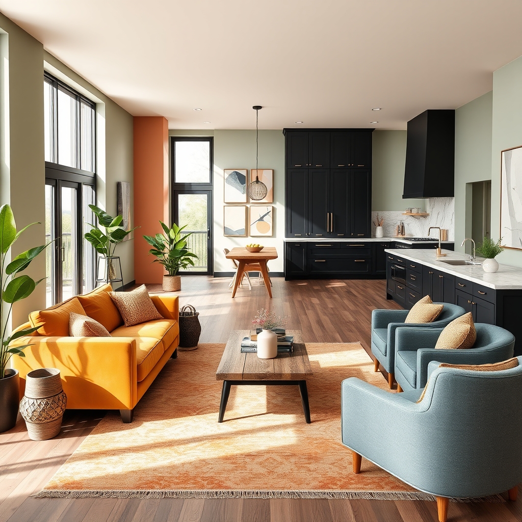
Color is one of the most powerful tools in modern home design, yet its impact often goes unnoticed. Beyond aesthetics, the hues we choose for our living spaces can influence mood, productivity, and even physical well-being. As interior design trends evolve, homeowners and designers are increasingly turning to color psychology to create environments that not only look stunning but also feel intuitively right. Whether you’re planning a full home renovation or simply refreshing a single room, understanding the emotional and psychological effects of color can transform your space into a sanctuary tailored to your needs.
The Science Behind Color Psychology
Color psychology is the study of how different hues affect human behavior and emotions. This field draws from neuroscience, cultural associations, and even evolutionary biology to explain why certain colors evoke specific responses. For example, warm tones like red and orange are often associated with energy and passion, while cooler shades like blue and green tend to promote calmness and relaxation. These reactions are not merely subjective; studies have shown that color can influence heart rate, blood pressure, and even cognitive performance.
In modern home design, this knowledge is leveraged to craft spaces that align with their intended purpose. A home office bathed in soft blues might enhance focus and productivity, while a bedroom painted in soothing greens could foster restful sleep. The key is to strike a balance between personal preference and the psychological effects of color, ensuring that the space not only reflects your style but also supports your lifestyle.
Trends in Color for Contemporary Living Spaces
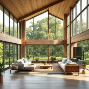
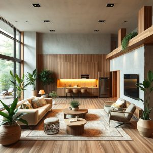
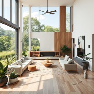
As we move further into the 2020s, interior design trends are embracing a more nuanced approach to color. Gone are the days of stark whites and monochromatic palettes dominating modern homes. Instead, designers are experimenting with layered hues, earthy tones, and even bold, unexpected combinations to create depth and character. One standout trend is the rise of “earthy minimalism,” which pairs muted, nature-inspired colors like terracotta, sage, and warm beige with clean lines and organic materials. This approach not only grounds a space but also fosters a sense of tranquility and connection to the natural world.
Another emerging trend is the use of “color drenching,” where a single hue is applied across walls, ceilings, and even furniture to create a cohesive, immersive experience. This technique works particularly well in smaller spaces, where it can make a room feel larger and more intentional. For those who prefer a subtler touch, accent walls and strategic pops of color—such as deep navy blues or rich emerald greens—can add drama without overwhelming the space. The key is to choose colors that resonate with the room’s function and the emotions you want to evoke.
Choosing the Right Palette for Your Home
Selecting a color palette for your home is a deeply personal process, but there are a few guiding principles to keep in mind. Start by considering the mood you want to create in each room. For instance, a living room designed for socializing might benefit from warm, inviting tones like ochre or burnt sienna, while a meditation space could thrive in soft lavenders or pale blues. Lighting also plays a crucial role in how color is perceived. Natural light enhances the vibrancy of hues, while artificial lighting can alter their appearance. Testing paint samples in different lighting conditions is a simple yet effective way to ensure your chosen colors look as intended.
Don’t be afraid to mix and match colors, either. Modern home design often embraces eclectic palettes, where complementary or analogous colors are used to create harmony. For example, pairing a deep teal with warm wood tones can evoke a sense of balance and sophistication, while combining soft pinks with muted grays can create a serene, contemporary vibe. If you’re unsure where to start, consider working with a custom home builder or interior designer who can help you navigate the vast world of color with confidence.
Incorporating Color Through Smart Design Choices
Color isn’t limited to paint; it can be introduced through furniture, textiles, artwork, and even smart home technology. For example, a bold-colored sofa or a statement rug can anchor a room and set the tone for the entire space. Similarly, incorporating natural elements like plants or wooden accents can add warmth and texture, enhancing the overall color scheme. In kitchens and bathrooms, where functionality is paramount, color can be introduced through cabinetry, backsplashes, or even appliances. A matte black refrigerator or a vibrant blue island can become a focal point while adding personality to the room.
For those embracing smart home technology, color can also play a role in creating dynamic, adaptable spaces. Smart lighting systems, for instance, allow you to adjust the color temperature and hue of your lights to suit different activities or times of day. Warm, dim lighting in the evening can promote relaxation, while cooler, brighter tones in the morning can help energize you for the day ahead. This level of customization ensures that your home’s color palette evolves with your needs, making it a truly responsive environment.
The Role of Texture and Material in Color Perception
Texture and material can dramatically alter how color is perceived in a space. A matte finish, for example, absorbs light and can make a color appear softer and more subdued, while a glossy finish reflects light, making hues appear more vibrant and intense. In modern home design, mixing textures—such as pairing a velvet sofa with a linen throw or combining smooth concrete with rough-hewn wood—can add depth and interest to a room while enhancing the overall color scheme.
Materials like stone, metal, and glass can also influence the way color is experienced. A marble countertop with subtle veining can introduce natural variation to a neutral palette, while metallic accents in gold or brass can add warmth and sophistication. Even the sheen of a fabric can change the way a color is perceived; a silk pillow in emerald green will catch the light differently than a wool one, creating a dynamic interplay of hues. By thoughtfully selecting materials, you can elevate your color palette and create a space that feels rich and layered.
Sustainable and Eco-Friendly Color Choices
As sustainability becomes a priority in modern home design, eco-friendly paint and materials are gaining popularity. Traditional paints often contain volatile organic compounds (VOCs), which can release harmful chemicals into the air long after application. Fortunately, many brands now offer low-VOC or zero-VOC paints that are safer for both your health and the environment. These paints come in a wide range of colors and finishes, making it easier than ever to create a beautiful, sustainable home.
In addition to paint, consider incorporating natural dyes and pigments into your design. Materials like clay plaster, lime wash, and even plant-based stains can add color while minimizing environmental impact. These options not only reduce your carbon footprint but also create a unique, organic aesthetic that aligns with the principles of biophilic design. By choosing sustainable color solutions, you can create a home that is as kind to the planet as it is to your well-being.
Designing a home that reflects your personality and supports your well-being is a journey, and color is one of the most powerful tools at your disposal. Whether you opt for bold, dramatic hues or soft, soothing tones, the key is to create a space that feels authentically yours. By understanding the psychology of color and making intentional choices, you can transform your home into a place that not only looks beautiful but also nurtures your mind, body, and soul. Every brushstroke, every textile, and every carefully chosen accent becomes a step toward crafting a sanctuary that is uniquely and unapologetically you.