The Ultimate Guide to Choosing the Right Color Palette for Your Home
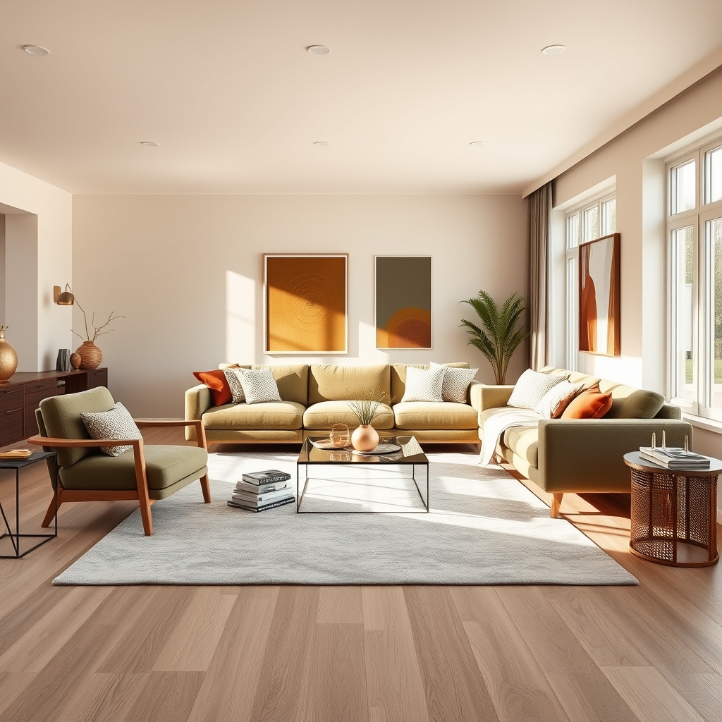
Color has the power to transform a space, influencing mood, perception, and even the way we interact with our surroundings. Whether you’re redecorating a single room or designing an entire home, selecting the right color palette is one of the most impactful decisions you’ll make. The process can feel overwhelming, but understanding color psychology, current trends, and practical application techniques can simplify the journey and help you create a home that feels both stylish and deeply personal.
The Psychology of Color in Home Decor
Colors evoke emotions and set the tone for a room long before furniture or decor is added. Warm hues like reds, oranges, and yellows are known to stimulate energy and conversation, making them ideal for social spaces like living rooms and dining areas. However, overusing warm tones can feel overwhelming, so balancing them with neutrals or cooler shades is often key.
Cool colors, such as blues, greens, and purples, are associated with calmness and relaxation. These shades work beautifully in bedrooms, bathrooms, and home offices, where tranquility is a priority. Soft blues, for example, can mimic the serenity of a clear sky, while deeper greens bring a touch of nature indoors, fostering a sense of balance and renewal.
Neutrals like whites, grays, and beiges are the backbone of many color palettes. They provide a versatile backdrop that allows other elements in the room to shine. Neutrals also create a sense of spaciousness, making them a popular choice for smaller rooms or open-concept layouts. However, relying too heavily on neutrals can result in a space that feels sterile or lacking in personality. Introducing texture, patterns, or pops of color through decor and furnishings can keep a neutral palette engaging and dynamic.
Trends in Home Color Palettes
Staying informed about current trends can inspire your color choices, but it’s important to adapt them to your personal style and the unique needs of your home. In recent years, earthy tones have surged in popularity, reflecting a growing desire to connect with nature. Shades like terracotta, olive green, and warm browns bring a sense of grounding and warmth to interiors, creating spaces that feel cozy and inviting.
Another trend gaining traction is the use of bold, saturated colors. Deep jewel tones like emerald green, sapphire blue, and amethyst purple are being embraced for their ability to add drama and sophistication to a room. These colors work particularly well in statement pieces, such as accent walls, furniture, or artwork, allowing you to experiment without overwhelming the space.
For those who prefer a more understated approach, monochromatic palettes are a timeless choice. Using varying shades of a single color creates a cohesive and harmonious look that feels effortlessly elegant. This approach works well in modern and minimalist interiors, where simplicity and balance are key. Pairing different textures within the same color family can add depth and interest to the space.
How to Choose the Right Palette for Each Room
Every room in your home serves a different purpose, and your color palette should reflect that. Start by considering the function of the space and the mood you want to create. For example, a kitchen is often the heart of the home, where families gather to cook, eat, and socialize. Warm, inviting colors like soft yellows, warm whites, or even a bold red can make the space feel lively and welcoming. If you prefer a more modern look, consider a sleek palette of grays and whites with metallic accents for a contemporary edge.
Bedrooms, on the other hand, should prioritize relaxation and rest. Cool tones like soft blues, lavenders, or muted greens are ideal for creating a serene atmosphere. If you love color but want to keep the space calming, consider using a neutral base with subtle pops of your favorite hue in bedding, curtains, or decor. This approach allows you to experiment with color without sacrificing the room’s tranquil vibe.
Bathrooms are another space where color can make a big impact. Lighter shades like soft blues, pale greens, or crisp whites can make a small bathroom feel larger and more open. For a spa-like retreat, consider a palette of warm neutrals, such as beige or taupe, paired with natural materials like wood and stone. If you’re feeling bold, a deep navy or charcoal gray can add a touch of luxury and sophistication to the space.
Practical Tips for Testing and Applying Your Palette
Before committing to a color palette, it’s essential to test your choices in the actual space. Lighting plays a significant role in how colors appear, and what looks perfect in a showroom or on a paint swatch may look entirely different in your home. Purchase sample pots of paint and apply them to small sections of the wall, observing how the color changes throughout the day as natural light shifts. This step can save you from costly mistakes and ensure you’re happy with your final choice.
Another helpful tip is to use the 60-30-10 rule, a classic interior design principle that creates balance in a room. The rule suggests that 60% of the room should be dominated by a primary color, 30% by a secondary color, and 10% by an accent color. This ratio ensures that the space feels cohesive without being monotonous. For example, you might use a neutral shade for the walls (60%), a complementary color for furniture and textiles (30%), and a bold accent color for decor and accessories (10%).
Don’t forget to consider the flow between rooms, especially in open-concept layouts. While each space can have its own personality, using a consistent color thread throughout the home creates a sense of harmony. This doesn’t mean every room needs to be the same color, but choosing a palette that complements one another ensures a seamless transition from one space to the next. For instance, if your living room features warm earthy tones, consider carrying those hues into adjacent spaces in smaller doses to maintain a cohesive look.
Ultimately, the right color palette is one that resonates with you and enhances the way you live in your home. It’s about creating a space that feels authentic, comfortable, and inspiring. Whether you gravitate toward bold, vibrant hues or soft, soothing tones, trust your instincts and let your personality shine through. The colors you choose will not only reflect your style but also shape the memories and moments that unfold within your walls, making your house truly feel like home.